News
Exel Insights: Menu Dashboards

It has been said that ‘the world’s most valuable resource is no longer oil, but data’, and this should come as little surprise to most people that have been carrying a smartphone with them for the past decade and have worried about the collection, and use, of their personal data.
Business though, has always had a need to collect and analyse data in order to make educated business decisions and plan future strategies.
For manufacturers in particular, the development of shop floor data capture devices and the software solutions that receive, store and manage that data, has led to large amounts of real-time data that can be immediately utilised to affect the hour-by-hour, or even minute-by-minute, operation of the shop floor.
For Field Service companies, with the advent of mobile devices running on a strong data network, the amount of real-time data these companies can capture and utilise is ever increasing. Like manufacturers, service companies are able to operate more efficiently, increase their agility and provide a superior customer experience when using this information to shape current and future business decisions.
Exel’s solutions embed business intelligence reporting tools into menu dashboards, with a choice between the open source ‘BIRT’ (Business Intelligence reporting Tools), and the suite of Microsoft’s latest business analytics tools, ‘Microsoft Power BI’. You are of course able to utilise both for different areas of the business.
Menu Dashboards

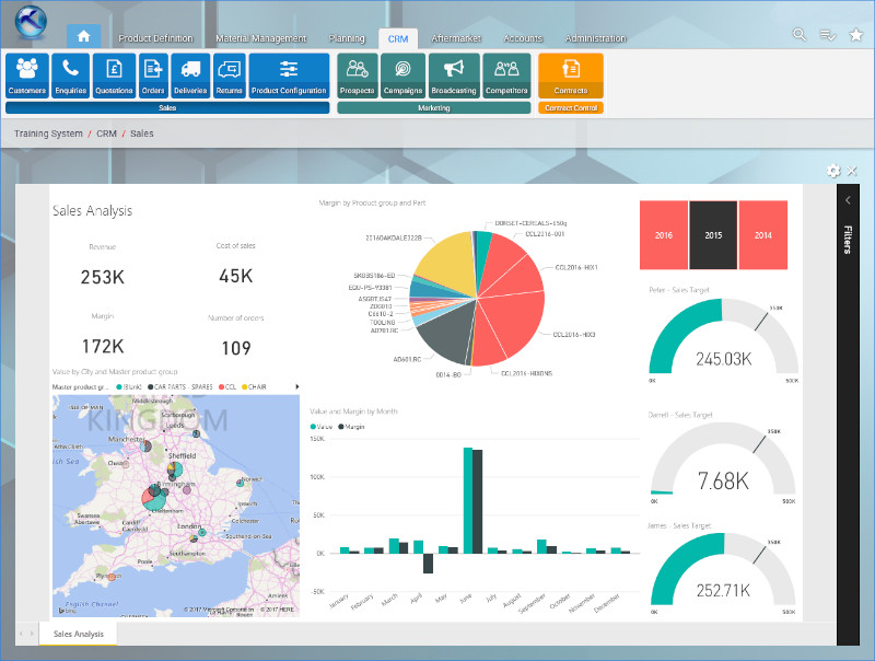
Presenting this information to the relevant people and places, in a quick and easy manner, is something Exel considered in its solutions. This is why Exel allows users, based on permissions and roles, to configure the reports that are pertinent to them and embed each particular report into a menu dashboard for any area of the software.
When a Sales Manager navigates to the ‘Sales’ area of the CRM module, they may want to see pie charts or graphs indicating where individual members of the sales team are in relation to their weekly target, whilst also viewing a map highlighting the volume of sales per geographical area. If they then move to the ‘Marketing’ area, it might show them recent campaign success as well as telemarketing call stats and event bookings.
A Production Scheduler is able to view staff and plant performance on the shop-floor, they can get a feel as to the efficiency of a particular line and even introduce competitiveness between lines. They are able to see statistics linked to quality conformance, enabling them to see if a particular process or resource is causing inconsistencies.
The embedded nature of these reports allows full drill-down to source data eliminating system navigation. You can cross-filter and cross-highlight between charts on the same dashboard. You are able to draw data from multiple sources, which can be consolidated, enabling a more integrated organisation. Anomalies and early warning signals can be spotted quicker and actioned more effectively. KPIs and statistics can now be easily shared around the business. You are able to gain an insight into each area of the business, potentially allowing you to make it more efficient, leaner and more cost effective.
The worth of data as a worldwide commodity may be questionable, the worth of your business’s data is unquestionable, data is the lifeblood of any business. How you achieve value from your data is something we are always considering.
To find out more, feel free to view the EFACS Menu Dashboards data sheet, click here
